

Imagine walking into a massive supermarket for a loaf of bread, but you can’t even find a directional sign. You wander between aisles of household chemicals and toys, waste ten minutes, and finally leave empty-handed for the store across the street. The same thing happens to your website if its structure is confusing.
A true expert knows: structure is the foundation. If it is logical, a person becomes a customer. If not, you are simply gifting your advertising budget to your competitors. 2026 analytics show that the correct arrangement of sections can increase orders by 30–40% without changing the price or the product itself. Let’s look at how to build the perfect path for your visitor.
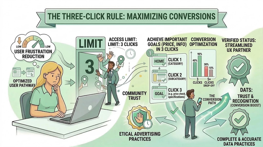
1. The Three-Click Rule This is the golden standard of the internet. Any vital information—whether it’s the price or technical specifications—should be accessible in no more than three clicks from the homepage. Interesting fact: every extra action on a site “eats up” to 20% of potential buyers. People are lazy (and that’s okay); they want immediate results. If the path to the “Buy” button feels like a quest, the customer will simply close the tab.
2. Main Menu: Less is More Many try to cram everything into the top menu: from company history to warehouse addresses. This is a mistake. The human brain can only effectively focus on 5–7 elements at a time. Keep only the most important items in the menu: product categories, services, contacts, and the “About Us” section. Move everything else (business hours, legal information, social media links) to the footer. By the way, analysis shows that a “sticky” menu, which stays at the top of the screen while scrolling, improves usability by 15%.
3. Pyramid Logic: From General to Specific Your structure should be intuitive.
- The Homepage is your storefront, answering “Who are you and how are you helpful?”.
- Categories are the shelves in the store.
- The Product/Service Page is the item itself that one can hold. Don’t skip levels. When a person arrives at a specific product via an ad, they must be able to easily return to the general category to compare it with others. We call these “breadcrumbs,” and they are incredibly helpful for both people and search bots.
4. Site Search: Your Secret Helper For websites with a large number of products, a search bar is a critical necessity. Statistics show that visitors who use on-site search buy 2–3 times more often than those who just browse sections. They already know what they want, and your job is to give it to them instantly. Ensure the search bar is prominent and can correct minor typos.
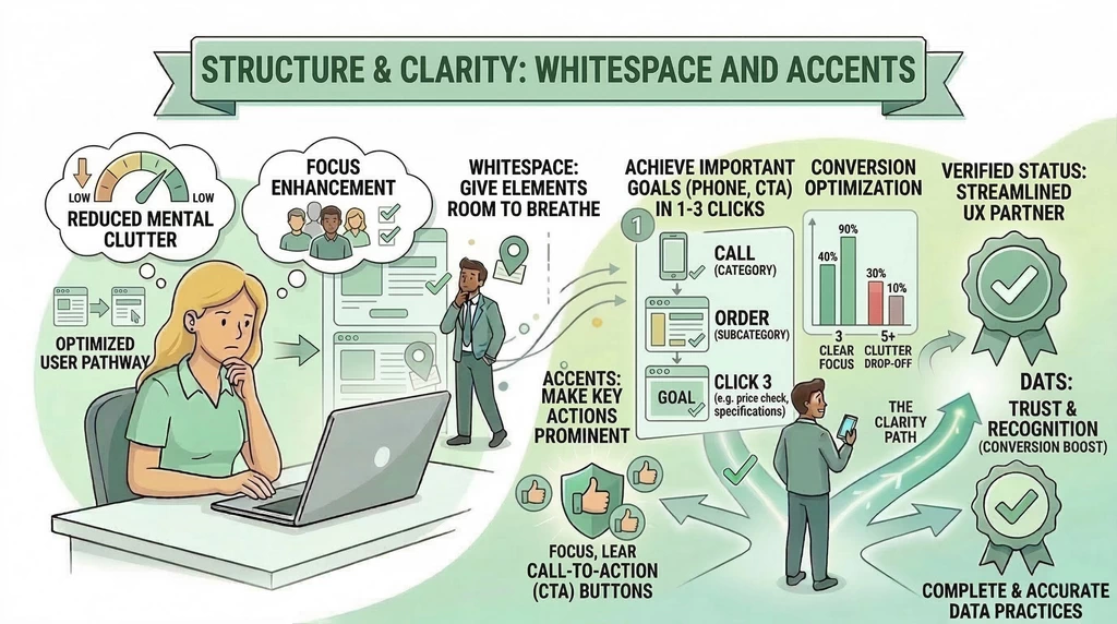
5. White Space and Accents Structure is not just about links; it’s about the layout of blocks on the page. Don’t be afraid of “air” (white space) between sections. When there is too much text and too many images on the screen at once, eyes get tired, and the person loses focus. Use large, clear buttons for the primary call to action. If you want people to call you, don’t hide the number in the “Contacts” section—place it at the very top of every page.
6. Mobile Adaptation is Part of the Structure Today, structure must be flexible. What looks great on a large monitor can turn into chaos on a smartphone screen. Check if important buttons overlap in the mobile version. In 2026, the usability of your structure on a phone is a major factor in whether Google places your site on the first page.
The ideal website structure is the one the user doesn’t notice. Everything should happen “naturally”: they enter, see something interesting, understand the benefits, and click the button. If you feel your site has too many complex transitions, start simplifying today. Remember: the customer isn’t paying for your complex technical solutions, but for the quick and easy fulfillment of their needs.


Comments