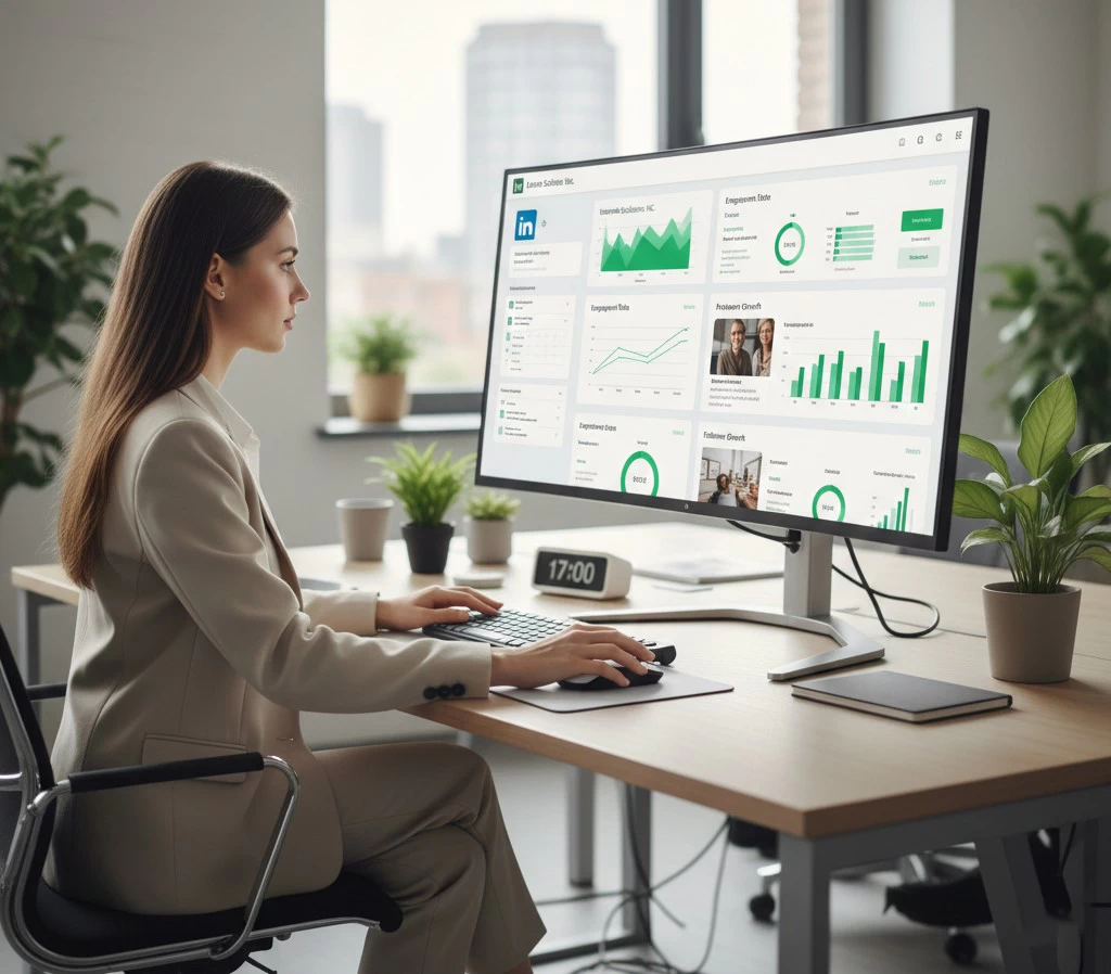
Have you ever wondered why you close one website tab within two seconds, while on another, you find yourself reaching for your credit card without even realizing it? It’s not magic, and it’s not even just about “pretty” design. It is the result of a clear structure that we call the anatomy of high sales.
In today’s digital world, the fight for user attention has turned into a true art form where every pixel on the screen matters. You can spend huge amounts on advertising and attract thousands of visitors, but if your page resembles a chaotic collection of images and complex sentences, those efforts will be in vain. Most business owners make the same mistake: they try to “sell” a product instead of “helping” the customer buy it.
Let’s break down the 7 essential page elements that turn an ordinary visitor into your customer.
1. The Main Headline: The 5-Second Rule
You have only 5 seconds for a person to understand where they are and how you can be useful to them. Forget phrases like “We are market leaders.” A true expert knows: a headline must answer the question, “What will I get?”. For example: “Clean water in your home in 1 hour” instead of “Water filter sales.”
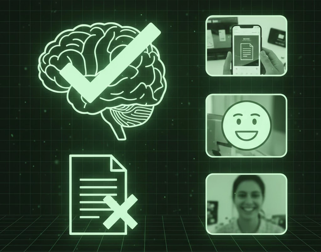
2. Visual Confirmation: Show, Don’t Just Tell
Analytics show that the brain processes images 60,000 times faster than text. If you are selling a product—show it in action. If it’s a service—show the result or the happy face of a client. The main rule: no “plastic” stock photos. A real photo, even if not perfect, inspires 10 times more trust.
3. Clear Benefits (Not to be Confused with Features)
People don’t buy a “1000-Watt drill.” They buy a hole in the wall to hang a picture. Instead of a dry list of technical parameters, write about how the customer’s life will become easier.
- Bad: “5000 mAh battery.”
- Good: “The phone holds a charge for two days, even with active use.”
4. Social Proof: The Power of the Crowd
We are social creatures. If we see that others liked it, we subconsciously begin to trust the brand. But be careful: “perfect” reviews without photos or links don’t work today. Video testimonials or screenshots of real conversations (with the client’s consent, of course) work best.
5. A Simple Path to Action
This is the “Buy” or “Book a Consultation” button. It should appear on every screen, be prominent, and be clear. Don’t make the person think. When there are ten different offers on a page, the brain gets tired and simply leaves. One screen—one specific action.
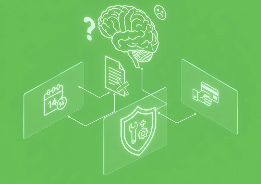
6. Guarantees and Addressing Fears
Before clicking a button, the customer always thinks, “What if…?”. What if it doesn’t fit? What if it breaks? Answer these questions in advance. A 14-day money-back guarantee, free maintenance, or payment upon delivery are the “hooks” that reduce anxiety.
7. Scarcity and Urgency (Without Deception)
Good old psychology: we are more afraid of losing than we are eager to gain. If a promotion ends tomorrow or there are only 3 items left in stock—say so. But be honest. If the timer resets every time the page reloads, you lose trust forever.
Creating a successful page is not about manipulation; it’s about respect for the customer. Make their journey clear, solve their problem, and do not overload them with unnecessary information. Do this, and you will see how casual visitors turn into loyal buyers.
Comments