

Ten years ago, a mobile version of a website was considered a nice addition—a “toy” for advanced companies. Today, the situation has changed radically: if your site is inconvenient to view from a smartphone, you simply don’t exist for most potential clients. We officially live in an era where the phone has become the primary window into the world of purchases and services.
The analytics of 2026 are relentless: over 75% of Ukrainian users start their product search specifically from a mobile device. Furthermore, search engines now evaluate your site based specifically on its mobile version. If it is slow or “clunky,” your search ranking will drop, even if the desktop version looks perfect.
1. Speed is Your Money
The first thing a user notices is how quickly the page loads. An interesting fact: if a site takes longer than three seconds to open, every second person simply closes the tab and goes to a competitor.
For business, this means a direct loss of profit. Optimizing images, ditching unnecessary animations, and proper server configuration are not just technical tasks—it is a battle to keep the client with you. In the mobile world, every millisecond has its price.
2. The “Rule of Thumb”
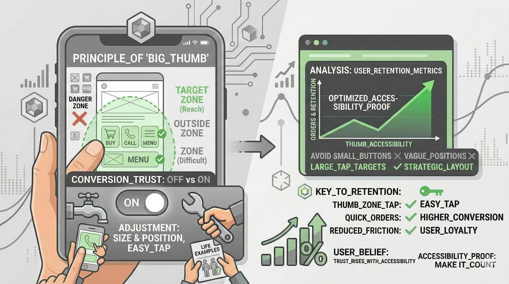
Think about how you hold your phone. Most often, we operate the device with one hand, using only our thumb. If your buttons are too small or positioned so that they cannot be reached without readjusting your grip, it’s frustrating. A true expert knows: all vital elements (the “Buy” button, “Call,” the menu) must be within the thumb’s reach. Analytics show that simply increasing button size and placing them correctly can increase the number of orders by 15-20% without any additional advertising costs.
3. Effortless Readability
No one wants to pinch-to-zoom to read a product description. The font must be large enough, and the line spacing comfortable.
Pro tip: On a mobile screen, short paragraphs of two to three sentences look best. This allows the brain to absorb information more easily “on the go”—in the subway, in a queue, or during a lunch break. If a user has to strain their eyes, they will go where the information is presented more simply.
4. Simplification of Order Forms
Filling out long forms on a small screen is a true test of patience. Every extra field in a registration form decreases your conversion.
Ask yourself: do you really need the client’s middle name and zip code right now? Ideally, a phone number should be enough to place an order. The fewer actions a person needs to take, the higher the probability they will complete the purchase. By the way, implementing one-tap quick payments (via digital wallets) increases mobile sales by nearly a third.
5. No Obstructive Pop-ups
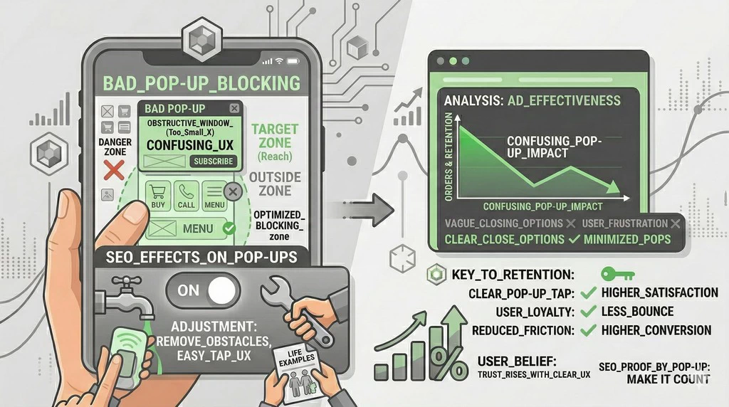
You have surely seen sites where, upon opening, the entire screen is covered by an ad or a newsletter subscription offer, and the “X” to close it is so small it’s impossible to hit. Search engines consider this a sign of a poor website and lower it in search results. Every millimeter is precious on a mobile screen, so don’t clutter it with unnecessary junk.
How to Check Your Site Right Now?
Take your smartphone, open your site, and try to place an order as if you were seeing it for the first time. Is it easy to find contacts? Do the images “float” or break the layout? Is it comfortable to tap the menu buttons? If you feel even the slightest discomfort, your customers feel the same, and you are losing money.
Mobile optimization is not about technology; it’s about caring for the customer. When a person is comfortable, they buy. When it’s easy for them to find an answer, they trust you. In 2026, the victory on the internet goes not to those with the “most beautiful” design, but to those who managed to make the customer’s journey from query to purchase as short and pleasant as possible on a smartphone screen.




Comments